This scenario-based eLearning concept project is designed to give new baristas an opportunity to practice real-life conversations with customers.
Throughout the course, the learner will navigate difficult conversations in a safe environment and see the consequences of their choices.
Ultimately, they will learn how to ask the right questions, leading to positive reviews and satisfactory customer experiences. This will have a direct impact on customer satisfaction KPIs and influence employee retention and sales KPIs.
Audience: New baristas at the Green Bean Cafe who have already successfully passed bar training.
Responsibilities: Instructional Design, Consulting with Subject Matter Experts (SMEs), Needs Analysis (Action Mapping), Script Writing, Storyboarding, Visual Design, Mockups, eLearning Development, Implementing Learner Feedback, and Quality Assurance.
Tools Utilized: Articulate Storyline, Vyond, Adobe XD, Adobe Illustrator, Adobe Photoshop, Adobe Audition, Twine, Miro, Revoicer, MindMeister, and Google Docs.
KPI: Complaints in the company app will decrease 20% by the end of next quarter as baristas ask questions to ensure order accuracy.
My Design Process
I started this project using the following as my guides:
·Map It by Cathy Moore
·ADDIE model
·Human-centered design principles
·Adult learning theory
·Map It by Cathy Moore
·ADDIE model
·Human-centered design principles
·Adult learning theory
I acted as a consultant utilizing 2 Subject Matter Experts (SMEs) to:
·create an action map
·write a script and storyboard
·design visual mockups
·build a prototype
·develop the full course
·create an action map
·write a script and storyboard
·design visual mockups
·build a prototype
·develop the full course
Within each step, I iterated on my designs and implemented SME and test-user feedback until the visual designs and copy fully supported a streamlined learner experience and the KPI of the project.
Action Mapping & Kickoff Meeting
I began my SME Kickoff meeting following Cathy Moore's Map It guidance on using questioning techniques to determine the root cause of the problem. My needs analysis started with targeted questions to identify business objectives, problems, and what actions baristas were doing correctly and incorrectly, and why.
Our analysis showed two needs categories: prevention and remediation of incorrect orders.
These had been having direct negative effects on the KPI we chose to target.
Through our discussion, we found a data point that was already being measured: the app reviews. We decided to use that metric as the basis for our training, and measure our goal progress using the app review KPI.
Through our discussion, we found a data point that was already being measured: the app reviews. We decided to use that metric as the basis for our training, and measure our goal progress using the app review KPI.
Our first draft of the action map in MindMeister captured all the major thoughts of our discussion:
Drafting Scenarios
We identified and documented a list of what behaviors baristas should complete to progress toward the goal. We also made a list of common mistakes baristas make, their causes, and documented how those specific behaviors lead to unintended negative consequences.
Several customers mentioned incorrect drinks as problems within the app review system. My SMEs and I discussed how to help customers correct their drink order if it is incorrect, and the consequences of not double checking for beverage variations.
Based on this data and knowledge of effective adult learning principles, we decided implementing an immersive, scenario-based training with correct and incorrect practice choices would best support customer satisfaction KPI.
We simplified our Action Map and included only the points that would have maximum impact within the training scenario:
As we began to discuss the order for the scenarios, my SME suggested we start with the remediation side of the map.
He said it was more realistic for a barista to take over a situation they didn't know the origins of, that they would need to know how to resolve. After that initial challenge, they would be able to prevent any issues on the next order.
I agreed with that assessment, and I switched the order of the scenarios.
Scripting & Storyboarding using Miro and Twine
After crafting a list of the most important learning scenarios and common mistakes from my SME, I sketched a storyboard that included all correct outcomes and common mistakes with their consequences.
This showcases the branching paths of our scenario and how the most common mistakes lead to substandard outcomes.
Common barista mistakes included:
Ignoring the customer until the customer speaks up first
Ignoring the customer until the customer speaks up first
Asking a shift supervisor to handle any potentially awkward interaction for them
Talking with other baristas to see what happened before they arrived on the floor (instead of problem solving directly with the customer)
Insisting they made the drink on the label, instead of asking questions
Talking with other baristas to see what happened before they arrived on the floor (instead of problem solving directly with the customer)
Insisting they made the drink on the label, instead of asking questions
Offering a free drink coupon to quell the customer instead of problem solving the root of the issue
After my initial hand-crafted draft, I used Miro and the post-it note feature to put together a rough draft to organize the layout of all possible choices for the script. Miro was the best choice for working remotely with my SME to accommodate their schedule, and afforded us a flexible editing space.
I deliberately crafted personalized feedback for each answer, and created a mix of consequences that would cater to both intrinsic and extrinsic motivation for the learner.
(Click images below to expand)
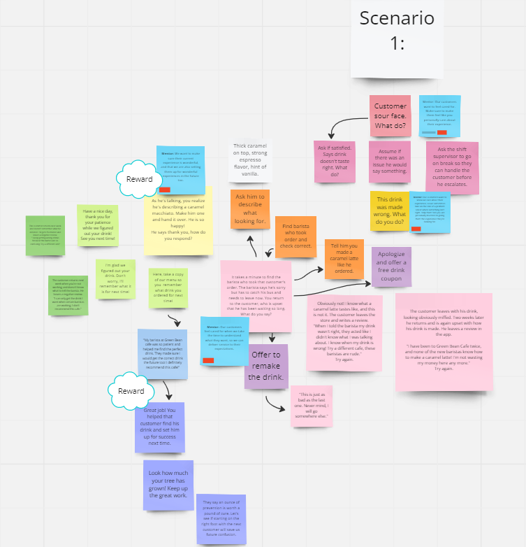
My first draft for scenario 1
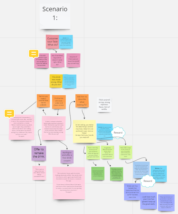
My cleaned up draft of scenario 1
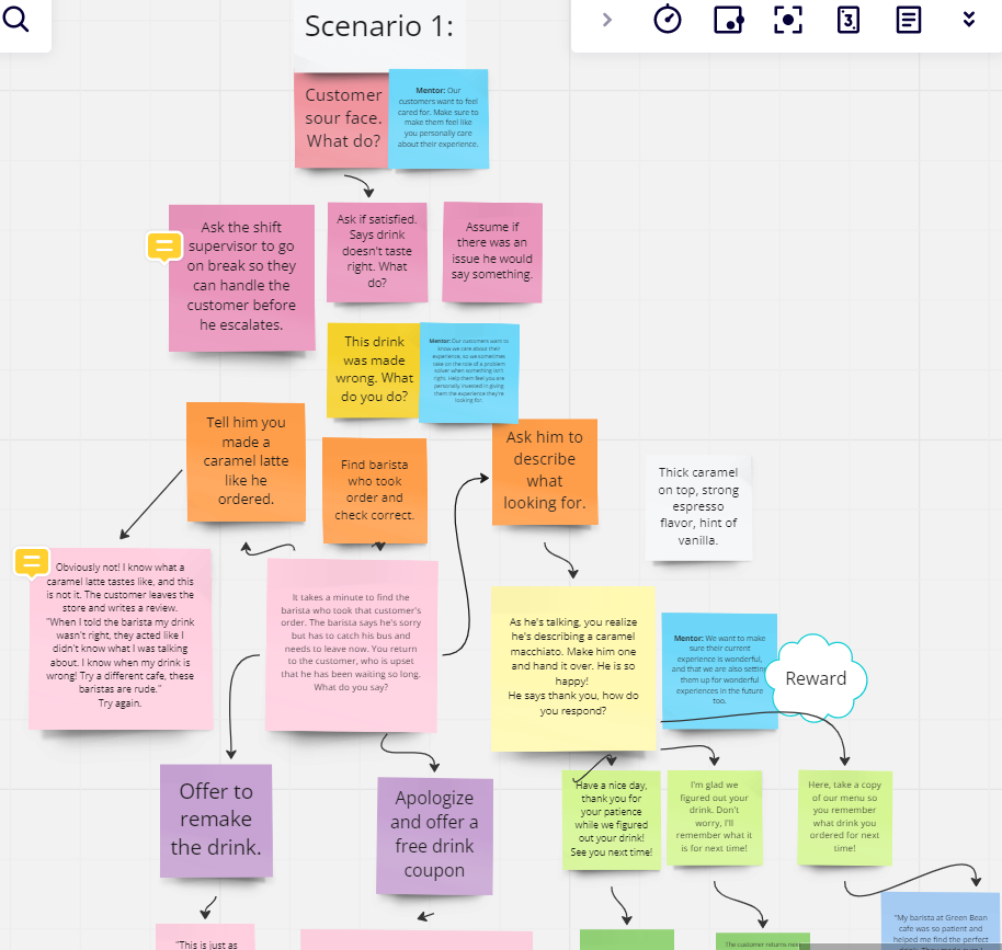
Zoomed in sample of scenario 1
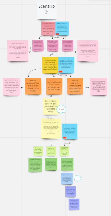
My draft of scenario 2
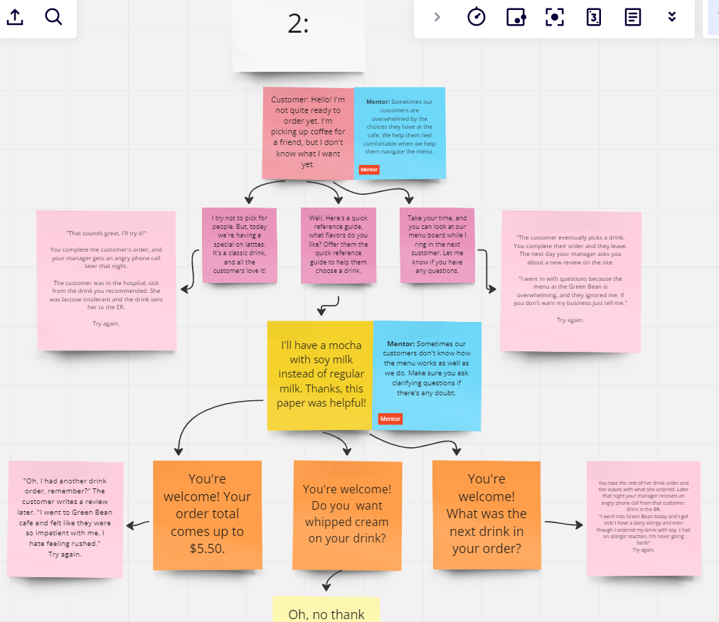
Zoomed in sample of scenario 2
Once the iterations in my rough outlines felt true to the real-life scenarios we discussed and I was confident the design of the training aligned to our action map, I sought SME approval. While they suggested minor edits, they thought the choices and consequences were spot-on. I got to work on official storyboarding and writing copy.
Overall zoomed out layout of both scenarios. This represents the entire training.
I used Twine to keep track of each slide and made sure to label each one individually. This supported a streamlined workflow when I reached development in Storyline, as all paths were systematically labeled and organized.
Each box represents a single slide with all the text for the scripting, including the mentor scripts and all verbiage for each step within the scenarios.
This image to the left shows the entire branching plan for the project. Each tile, when clicked, reveals the script and coordinating animations to program for that slide.
I also made sure the outcome for each answer, mistake or not, would lead to realistic consequences that baristas could easily learn from. My SMEs were thrilled that the scripts represented the barista thinking that typically led to our identified mistakes, and demonstrated the outcomes they were trying to avoid.
While drafting my final copy, I paid special attention to the wording of each answer choice. While I included two mistakes along with a correct answer as possibilities for each step, I carefully drafted each choice to ensure that it was not too obvious which answer was correct. I kept the length of responses to a similar word count, and included wording for incorrect answers that could plausibly be confused for a correct answer.
When drafting for my mentor script, I designed the copy to allude to our goal for the outcome of each interaction, without giving it away directly. This would encourage critical thinking and engagement from our learners as they decided which path to choose.
(Click images below to expand)
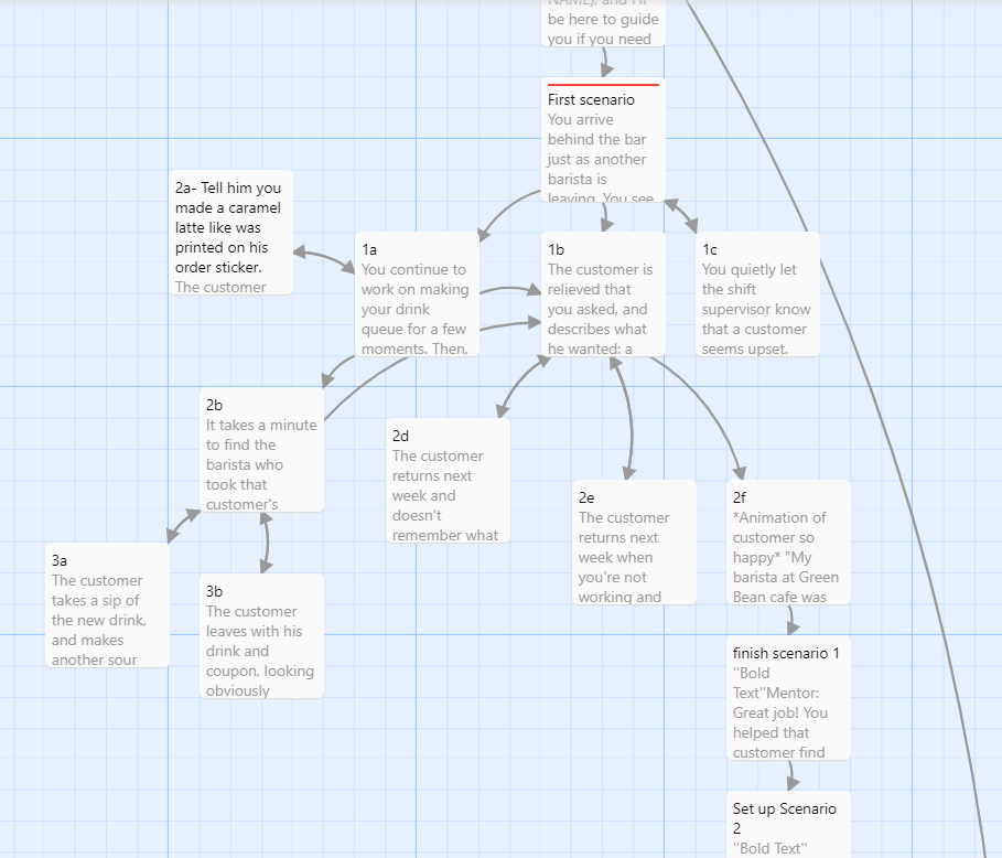
Zoomed in on scenario 1 tiles
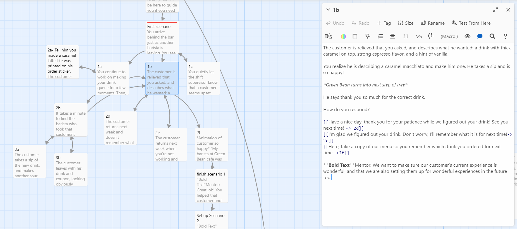
A sample of the copy written within one slide for scenario 1
The part I loved most about Twine, and what made it so invaluable to me as a tool, was that once all the copy was written, I could test out the interactions. It was an impactful way to ensure that all the scenarios flowed together and that the branching stories were programmed correctly. This set me up for success later when I developed my slides in Storyline.
Here is a sample of what the click-through scenarios looked like in Twine's interface. Text in blue represented a clickable link to that slide's copy, which made testing the scenarios a breeze.
I set up a remote meeting play-through session with my SMEs to run through the training.
This session resulted in multiple suggestions, the largest of which improved the storytelling of the training, which sparked another iteration.
In scenario 2, the customer gave their order, a mocha with soy milk, to the barista. The barista needs to ask if she still wants the whipped cream, as the menu states that all beverage components stay on the drink unless asked to be modified. Some customers miss the nuance of this, which in worst case, can lead to allergic reactions, thinking that asking for soy on a drink also means the whipped cream is negated as well.
To show the real-life consequence of not asking clarifying questions, I drafted a negative review that was written from the hospital. My SME suggested maybe re-writing it with the ambulance showing up to the cafe. We loved the idea and drafted new copy.
Once the storyboard was approved by all SMEs, I moved on to wireframes and mockups.
Mockups in Adobe XD, Adobe Illustrator, and Vyond
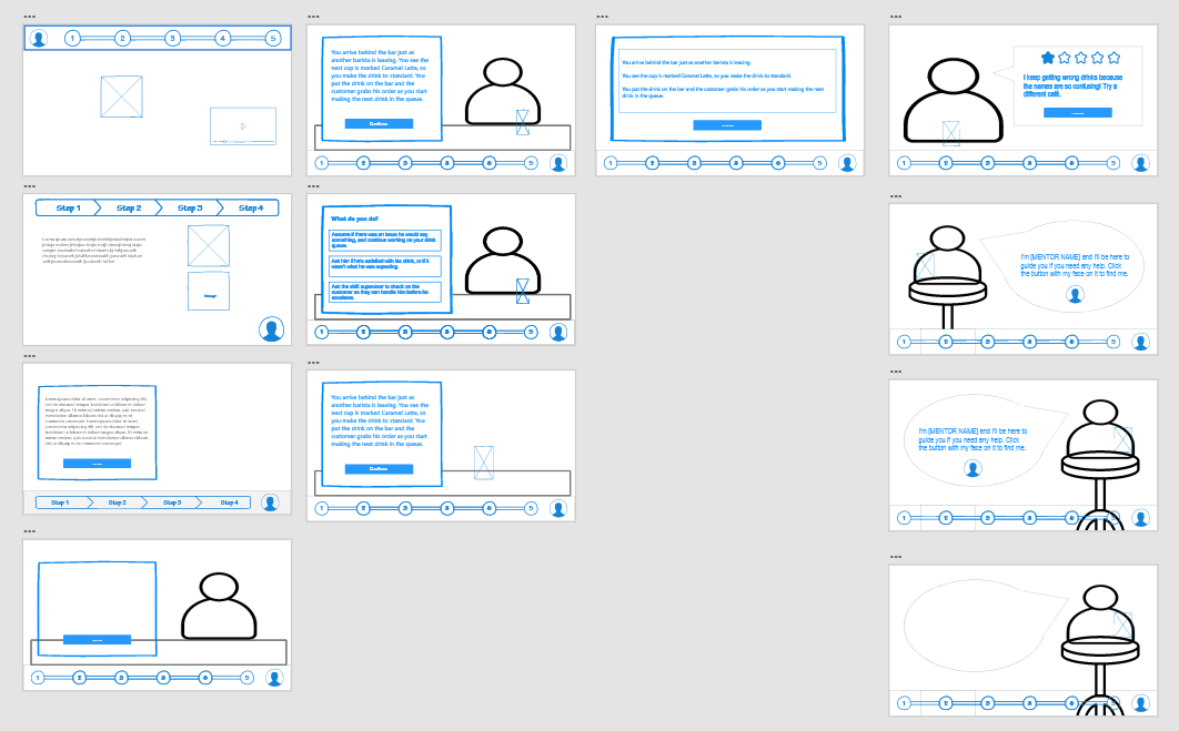
I started with low-fidelity wireframes to get the general look and feel in Adobe XD.
I wanted to make sure:
·the bean meter was clear but unobtrusive
·the mentor button was easy to find, but not required viewing so learners choose when they need support
·the visual weight of the text boxes, speech bubbles, and answer choices balanced with the characters
·the overall user interface design was intuitive to use
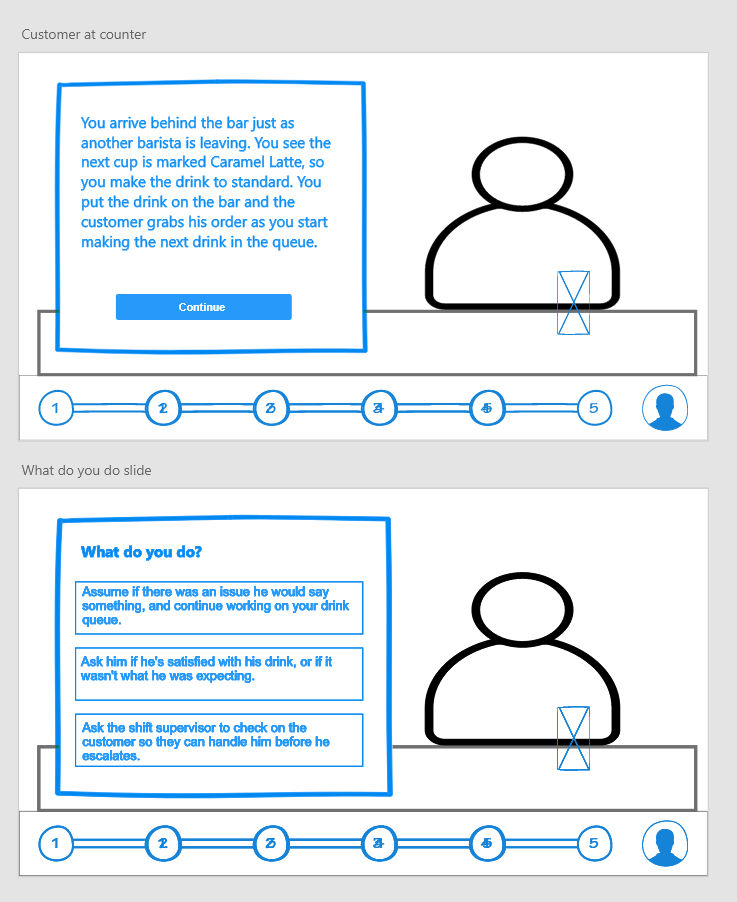
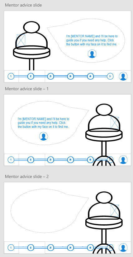
While I waited for feedback from my SMEs on layout, I iterated on text options and color schemes.
(Click images below to expand)
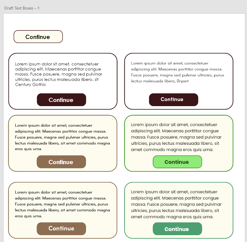
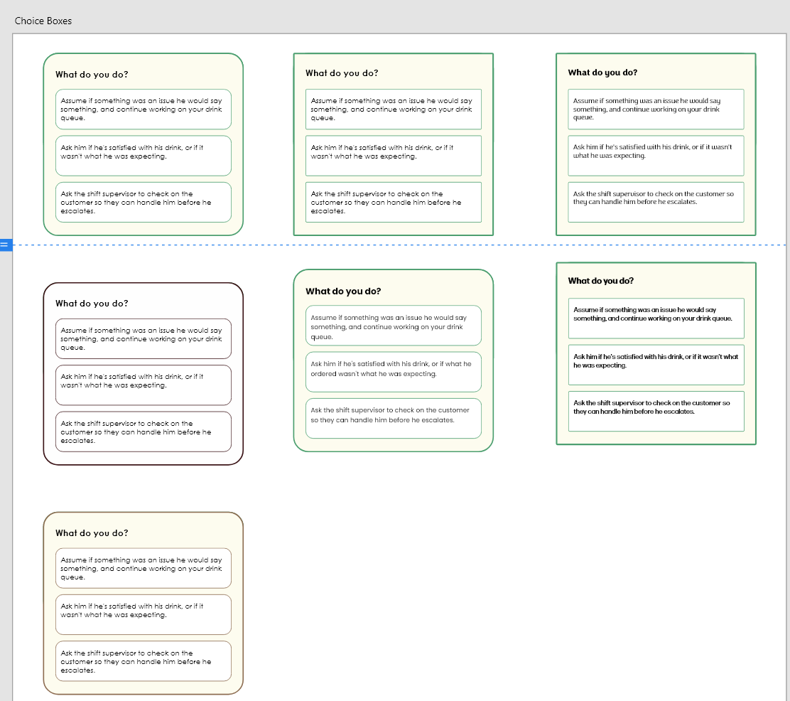
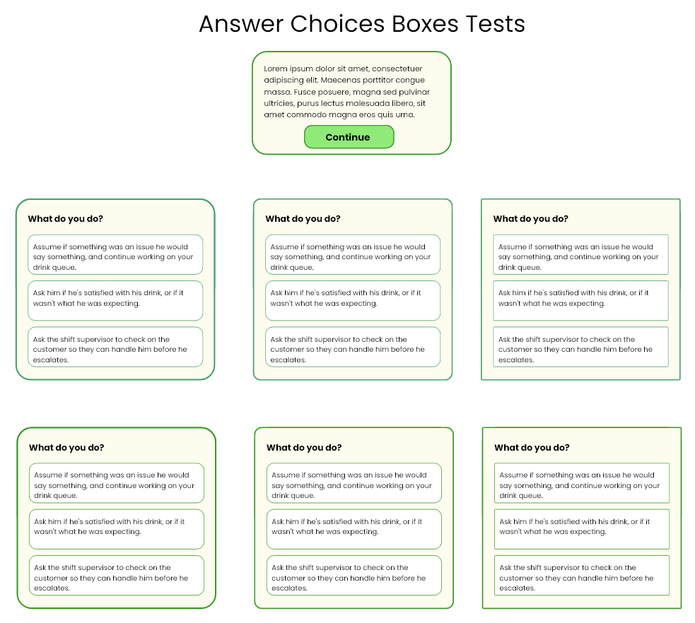
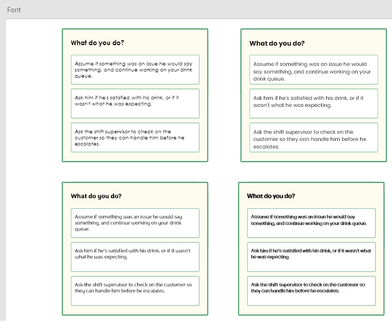
I determined that green worked best for the look and feel of the training, and aligned with company branding.
To ensure accessibility, I started testing different hues for contrast ratio.
To ensure accessibility, I started testing different hues for contrast ratio.
(Click images below to expand)
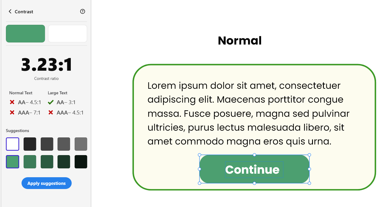
This was my initial button color choice, but it was not going to be accessible.
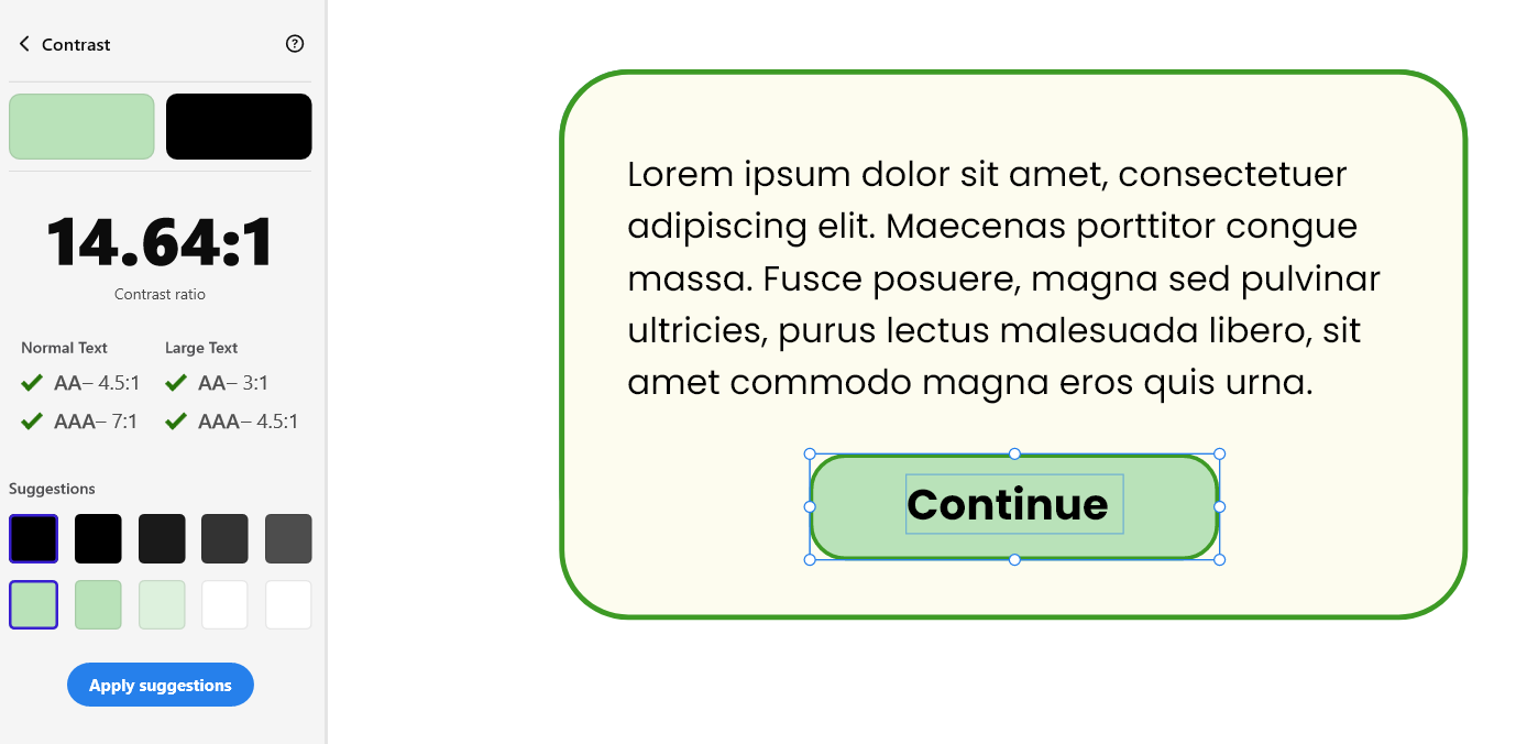
This button passed with flying colors (pun intended), and made it to the final cut.
First row of boxes: First draft of button colors
Bottom row of boxes: Final draft of buttons
Bottom row of boxes: Final draft of buttons
Once the iterations were completed, I finalized the color palette and fonts.
By the time I finalized the color scheme, my SMEs had approved my wireframe layout for the characters and text. I began creating my character designs and cafe layout within Vyond.
I chose to include greens into the walls of the cafe to match the look and feel of the text boxes, as well as to echo the branding of The Green Bean Cafe.
I iterated on the cafe design until it was visually balanced and left space for the customers to come to the registers in later scenarios.
(Click images below to expand)
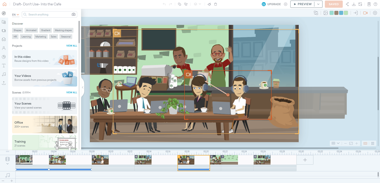
This was the first iteration of the cafe. I decided to simply and flip the side of the bar with the espresso machine to balance the visual weight.
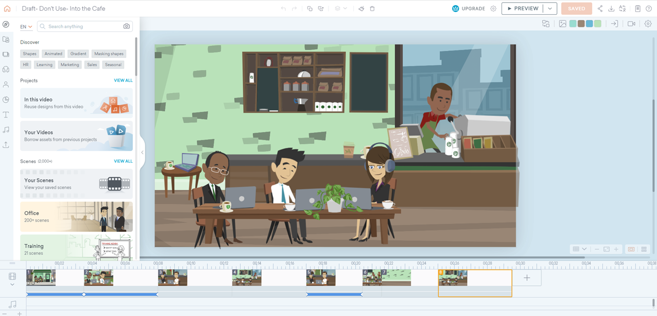
This was the final draft of the cafe. It felt more open and less cluttered. It would make it easier in the later scenarios to see the customer standing at the register/bar area, but still feel visually balanced.
After I had the cafe layout completed, I designed our main characters.
Then, I used Adobe XD and Vyond to visualize the feel for the layouts of the videos. I iterated on text, colors, and layout for the design through different scenes in the training.

I iterated several times to make sure our mentor screen was visually balanced. Ultimately, we decided to take away the table because it felt visually distracting.
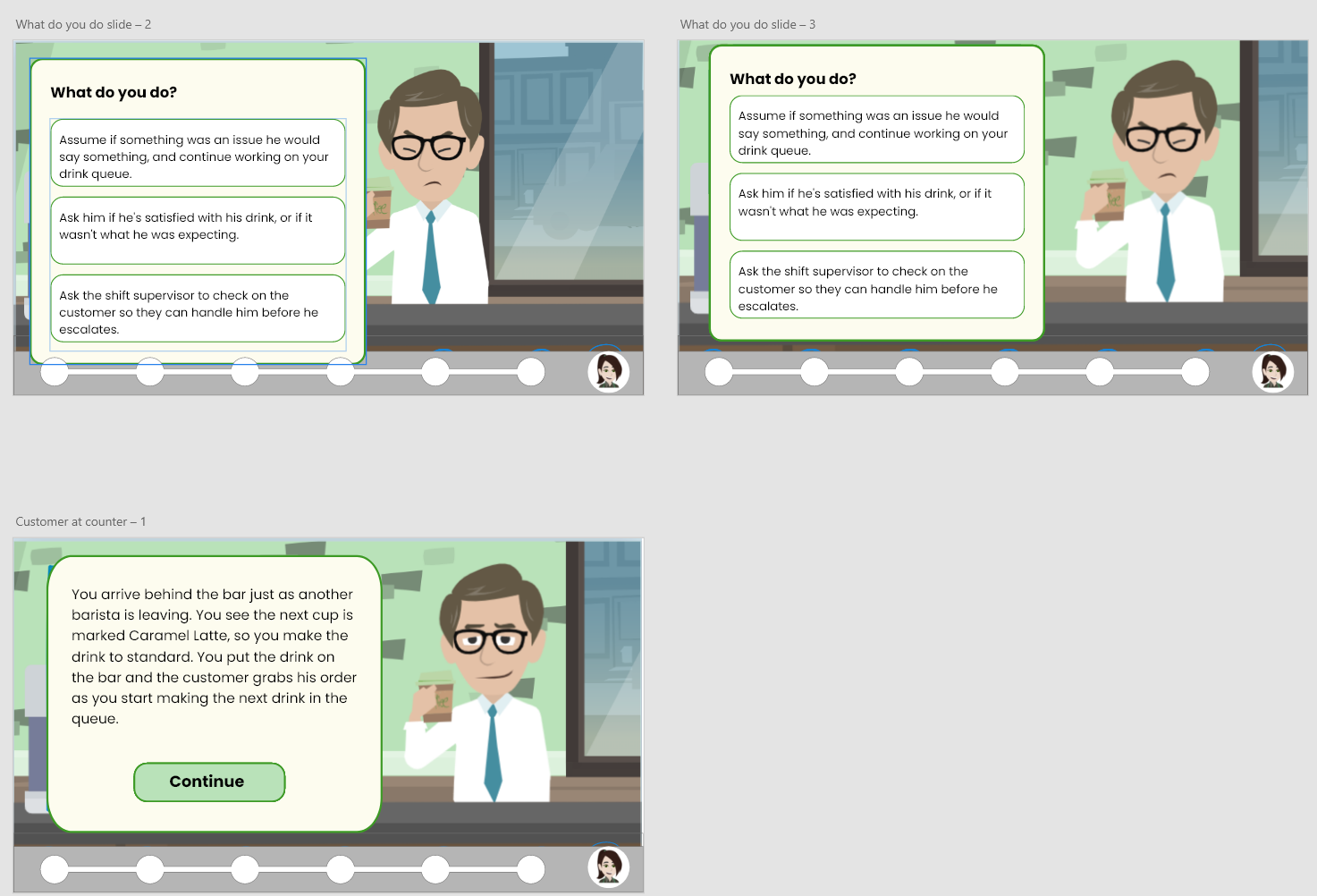
Scenario 1 designs.
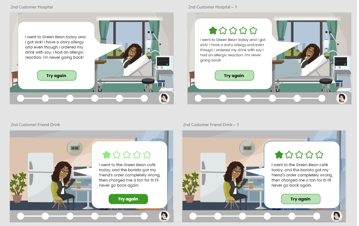
Scenario 2 designs, iterating on how to best show the negative review screens.
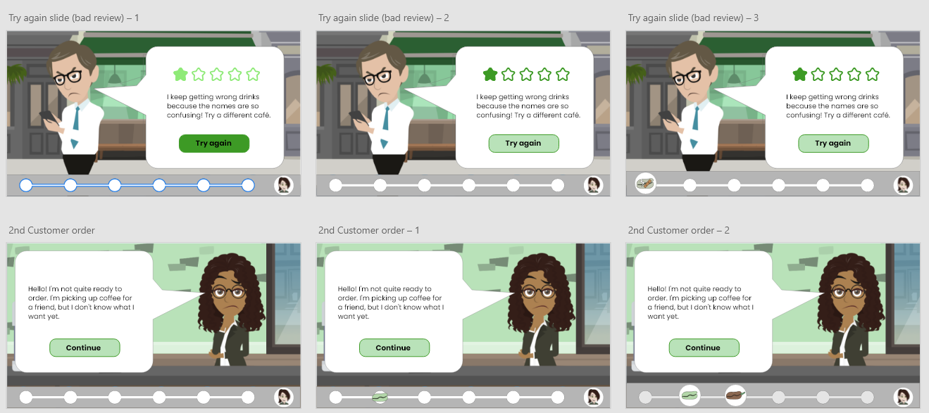
Iterations on review color, and starting to use bean designs.
The title screen went through a few rounds of brainstorming. It was important to match the look and feel of the rest of the training, but also feel inviting to the learner. We went through several drafts of graphics, font, and layout before deciding on a final design.
Once we got the look and feel down for the slides in general, it was time to design the beans for the bean meter. They started as sketches, then I used Adobe Illustrator to design the final graphics.
I opted for simple, abstracted representations to match the feel of our characters and keep them recognizable when shrunk into the bean meter.
I liked the idea of adding faces to the beans, to add endearment and buy-in from our learners to motivate them to continue growing the plant.
I researched the growth processes of actual coffee plants, and it informed my designs. You can see my iterative process in illustrator and how that brought the sketches to life.
I also used variations of the greens and browns included within the cafe design for the color scheme of the beans.
(Click images below to expand)
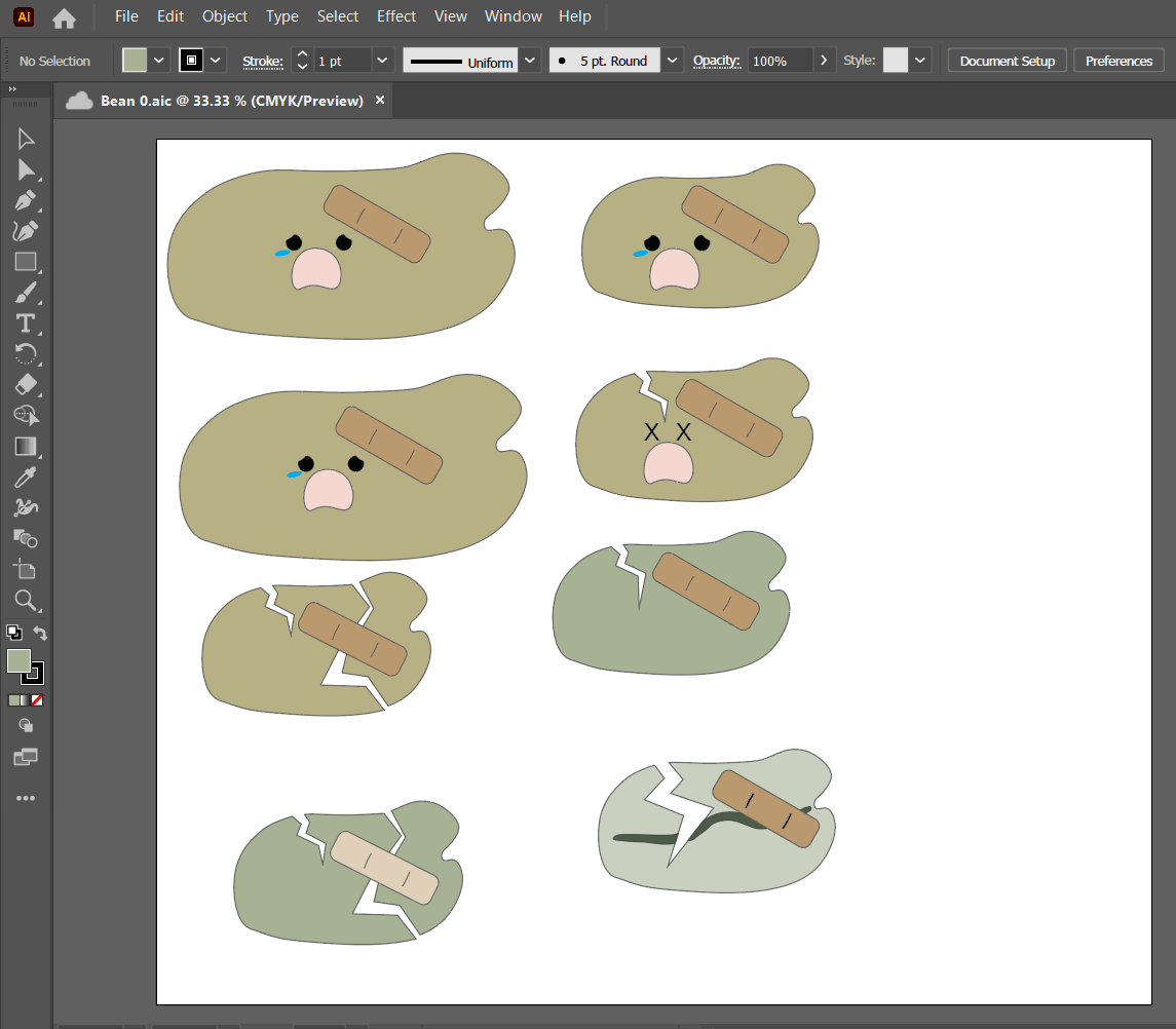
Crushed bean iterations for incorrect answers.
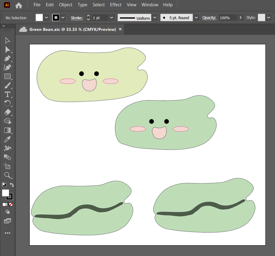
Green bean to start our scenario.
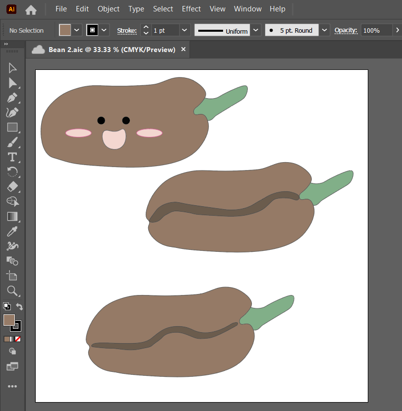
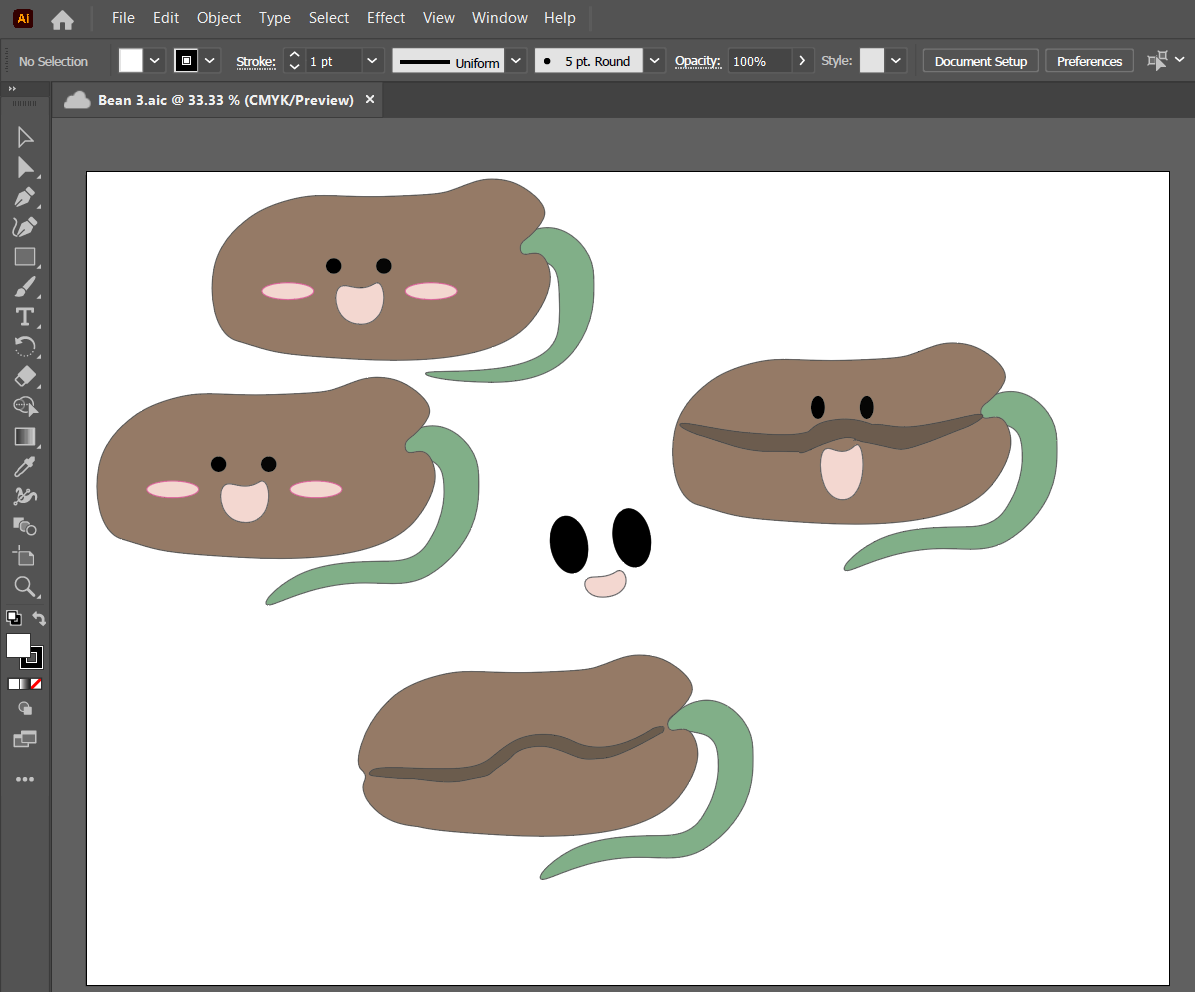
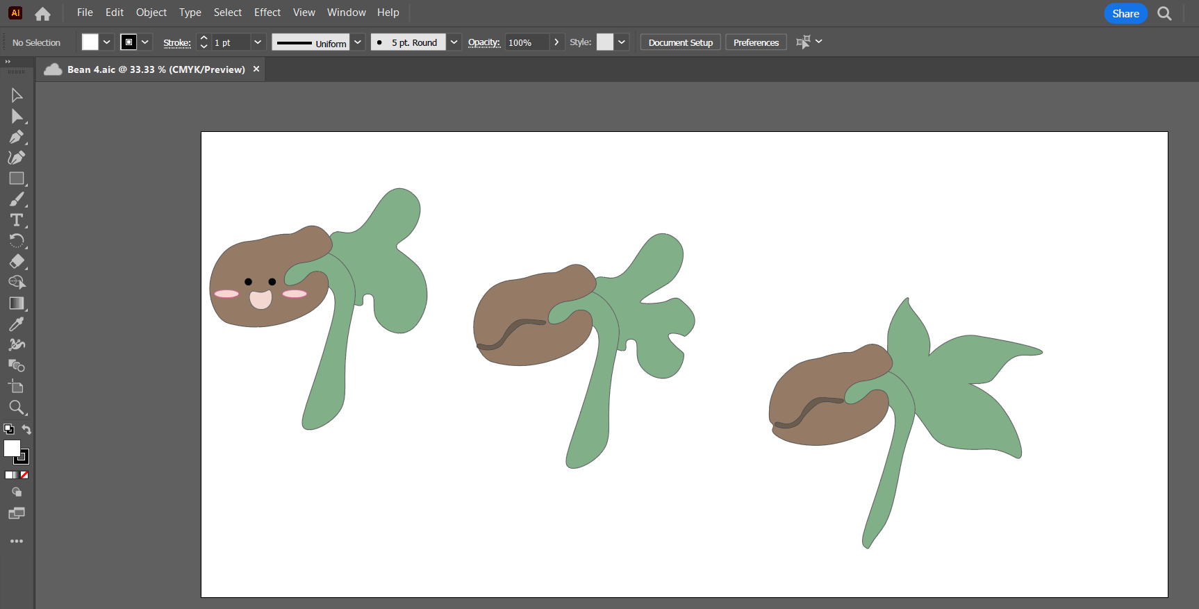
I didn't realize until my research that coffee beans actually grow out of the ground and suspend in air, while the roots hold strong below. It made for a fun illustration!
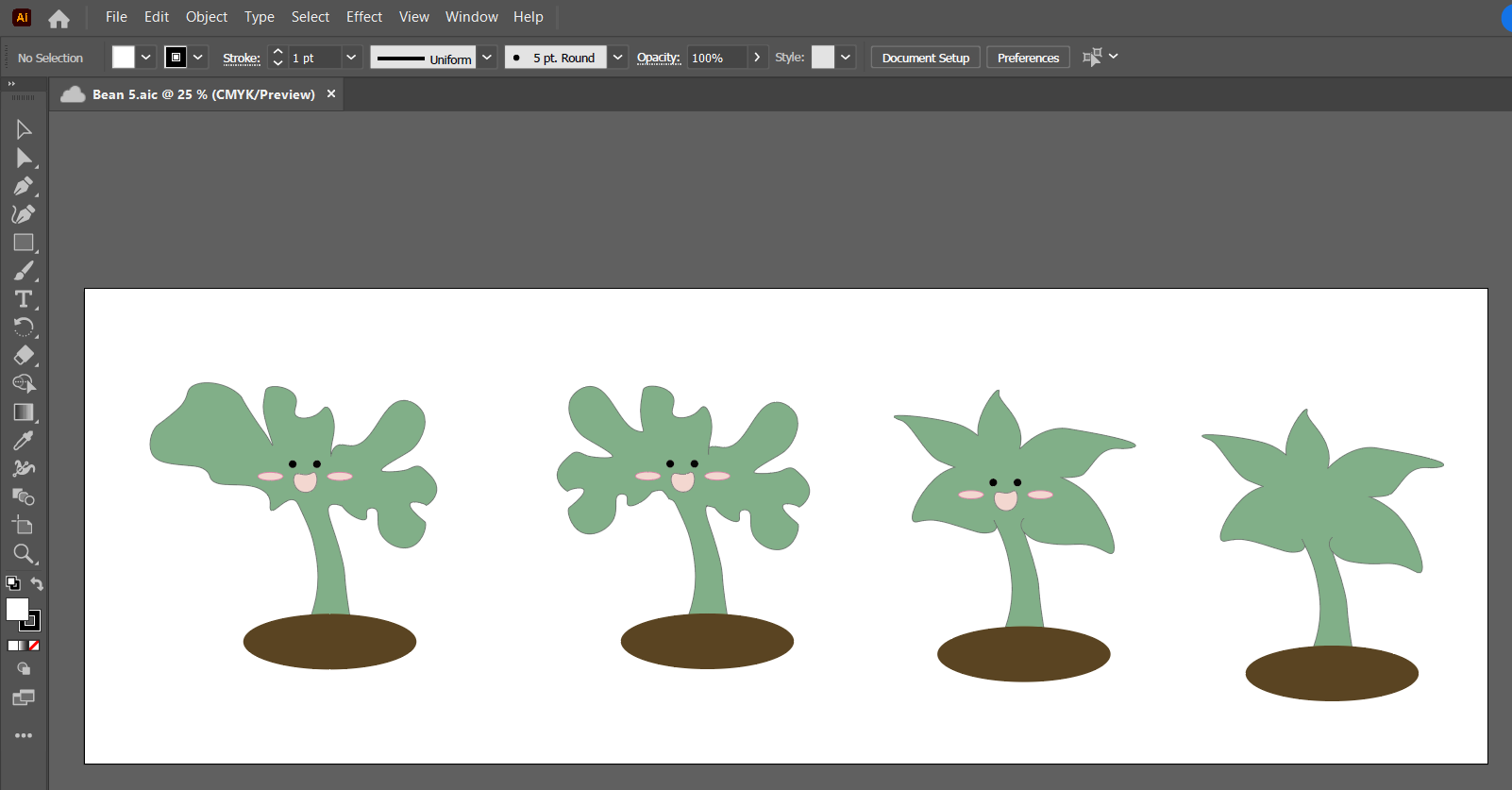
Making the bean tree look like an actual coffee plant was tricker than I anticipated.
As much as my SMEs agreed with me that the beans with faces did boost buy-in and were cute, the experts preferred the more "realistic" bean drawings.
We decided to keep the smiley tree for the last stage, as an extra boost of reassurance for the learner that they did great work.
Our final renderings are in the image to the left.
I then transferred all the illustrations into Adobe Photoshop and formatted them with white and grey backgrounds to make the buttons for the bean meter.
Prototyping Scenario 1
The next stage was developing a prototype of scenario 1 in Articulate Storyline, to share with a small group of test learners.
I created dozens of animations in Vyond to use in our prototype. I enjoyed implementing visual storytelling techniques where appropriate, including using zoom and pan features to set the scene for our story.
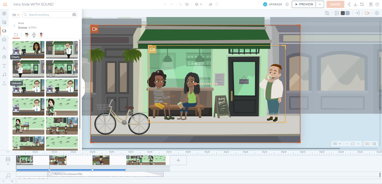
Opening scene on our cafe. I used the camera feature to make the scene zoom in to begin our story.
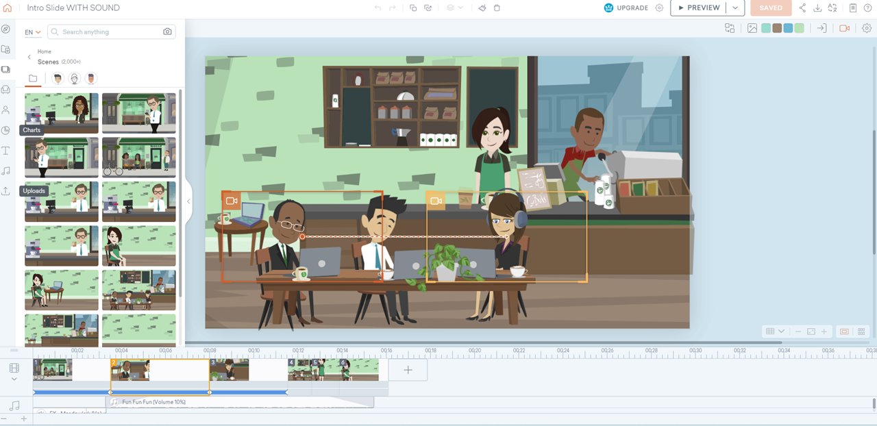
First pan within our cafe. I wanted to set the scene on the customers, which is the reason we have the cafe. After panning through them, we move to the bigger picture.
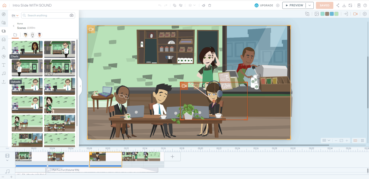
The scene then zooms out so we can see the entire cafe, and our mentor waiting to greet the learner.
After making the videos, I developed them into the training using Articulate Storyline. I set up the first few answer choices within scenario 1, and then had the learners test the draft.
The learner feedback was invaluable for the process.
The small group agreed they loved the visual storytelling, the visual design, and the look and feel of the project. Many learners commented they thought the questions were tricky and and gave them realistic consequences, and they appreciated opportunities to try again to correct their mistakes immediately. They all agreed they were sad when their beans got crushed.
They also had suggestions for how to improve their experience, the most impactful of which were changes in animations.
Screenshot of the "negative review" screen, where the text was changed from entirely "fade in" to a "wipe" animation so text enters line by line. I also added a blinking line to simulate a cursor.
For the "negative review" slides, a learner mentioned that the fade-in for the text all at once made it feel the same as the speech bubbles from earlier in the learning.
They suggested having the text come in a letter at a time to make it feel like the words were being typed.
I changed the animation from "fade in" to "wipe", and had all the text animate in line by line. I also added a blinking line at the end of the text to simulate a cursor.
Another suggested change was in the "How do you respond?" boxes.
Originally, the header for the box and the text boxes all faded in at once. The learners felt this was overwhelming and too much cognitive load at once; they weren't sure where to look first.
Some missed the question at the top entirely and weren't sure what to do.
Instead, I had the header animate in first, then a second later had the text boxes fade in.
Learners reported this change helped them feel more grounded in the learning and less overwhelmed.
Screenshot of the "How do you respond?" box. The animations were changed per learner request. Instead of all animating in together, the header animated in first, then the boxes animate in after to lessen cognitive load.
After scenario 1 changes were approved by the focus group and SMEs, I began development on the full project.
Full Development
I continued to develop all of scenario 2 and the full project in Articulate Storyline. I matched slide labeling to my storyboard in Twine, which kept my workflow organized.
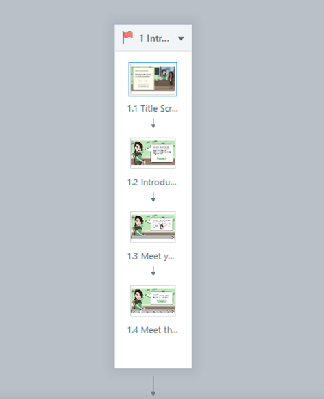
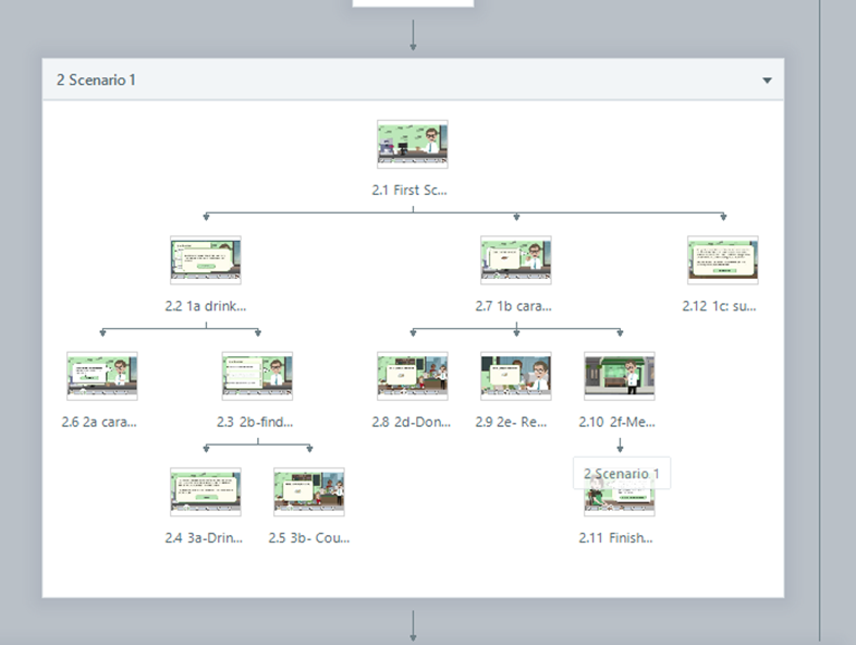
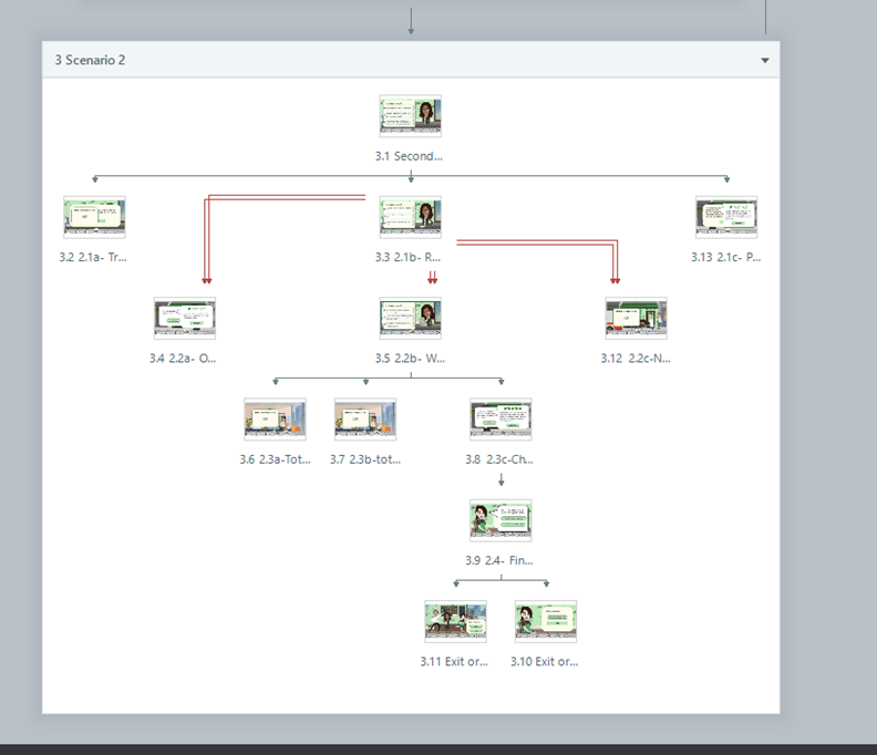
I also used Adobe Photoshop to import images from Adobe Illustrator and Adobe XD to ensure all images would fit within the buttons as desired.
I used Articulate 360 Review to gather feedback as I worked and keep track each edit.
While I gathered most sound effects from Pixabay, I did record a few custom audio tracks using Adobe Audition.
Here, I created a "texting" sound effect to be used within the customer review slides, by recording the texting noises from an iPhone on my home microphone.
I used Adobe Audition for minor editing before inserting the audio into Storyline.
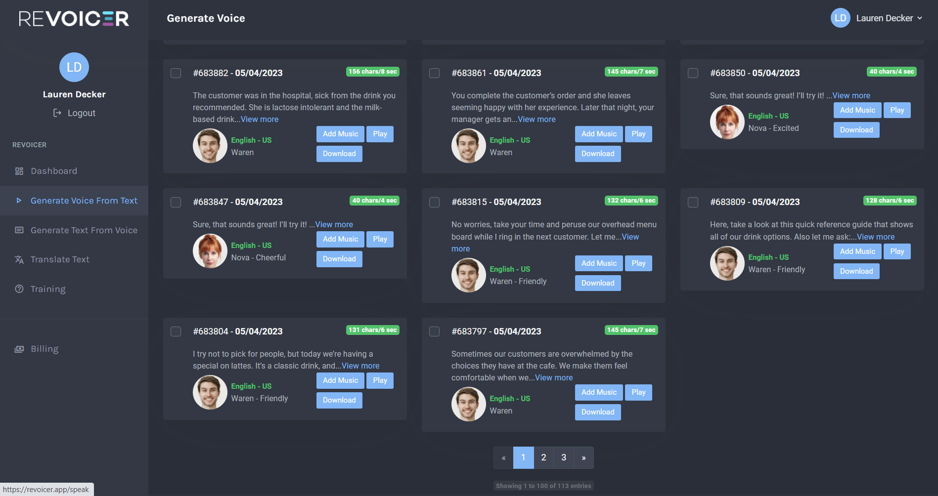
I used Revoicer to complete the audio narration for the project.
I chose different AI voices for each character and recorded hundreds of audio clips for the training.
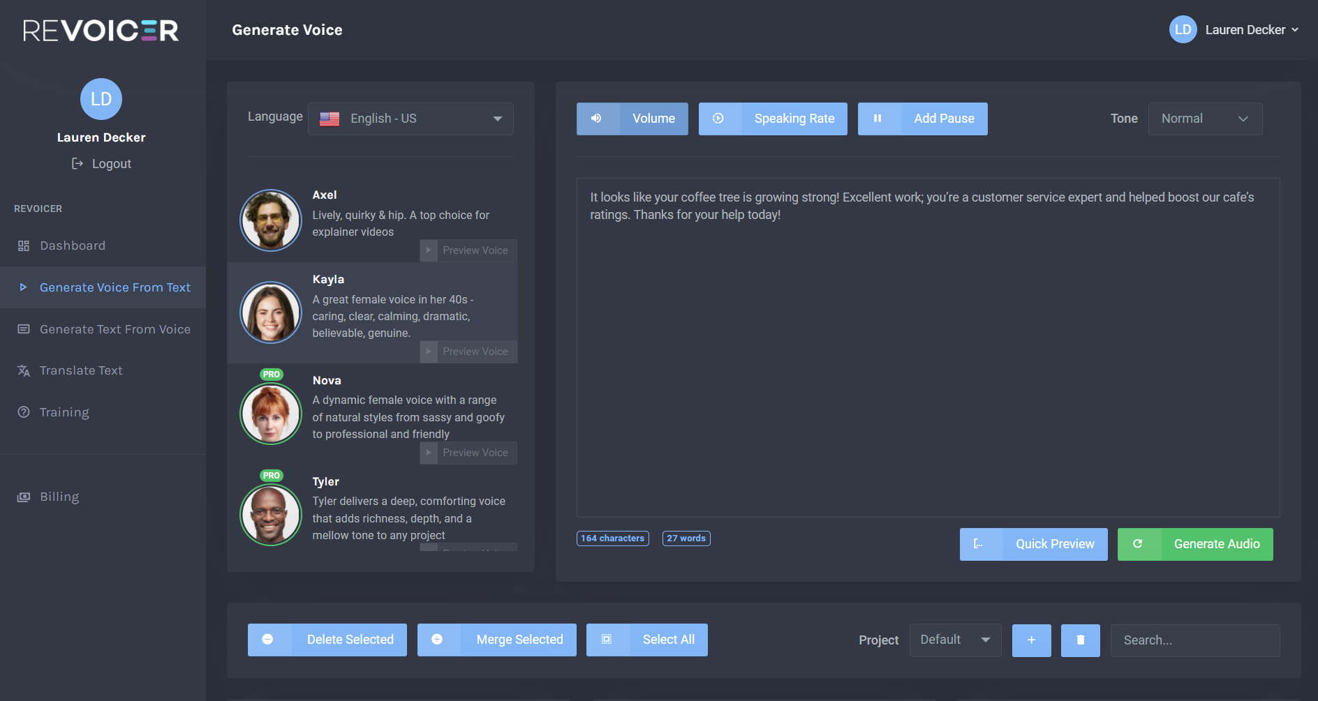
Recognizing learners have different needs, I decided to program a variable within the first slide so the learner can choose if they want narration throughout the course or not.
All audio narration was then programed to that variable using conditional triggers.
The audio narration is also programmed to stop when the learner hits a "continue" button, so it doesn't talk over the next animation.
(Click images below to expand)
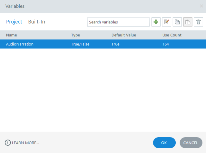
The Audio Narration variable I programmed.
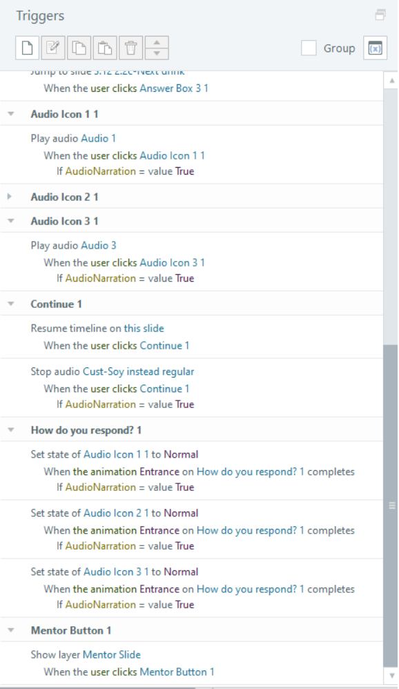
Example triggers panel, showing the conditional use of audio if AudioNarration=True.
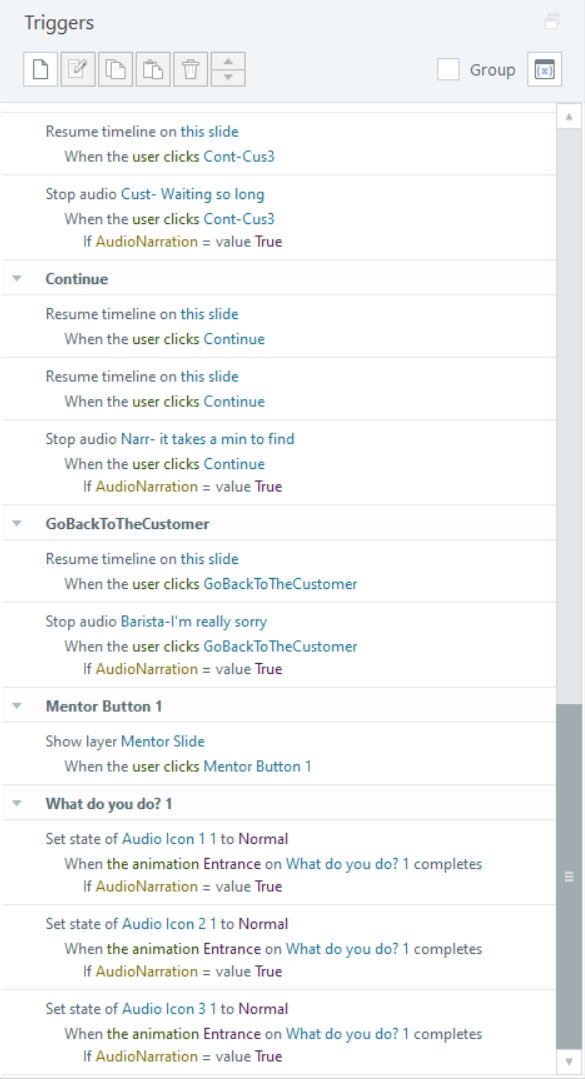
Another example from a slide of the triggers panel.
Adding the extra triggers did take some time, but it was worth it to make the course seamless, boost engagement, and give the learner options to support their needs.
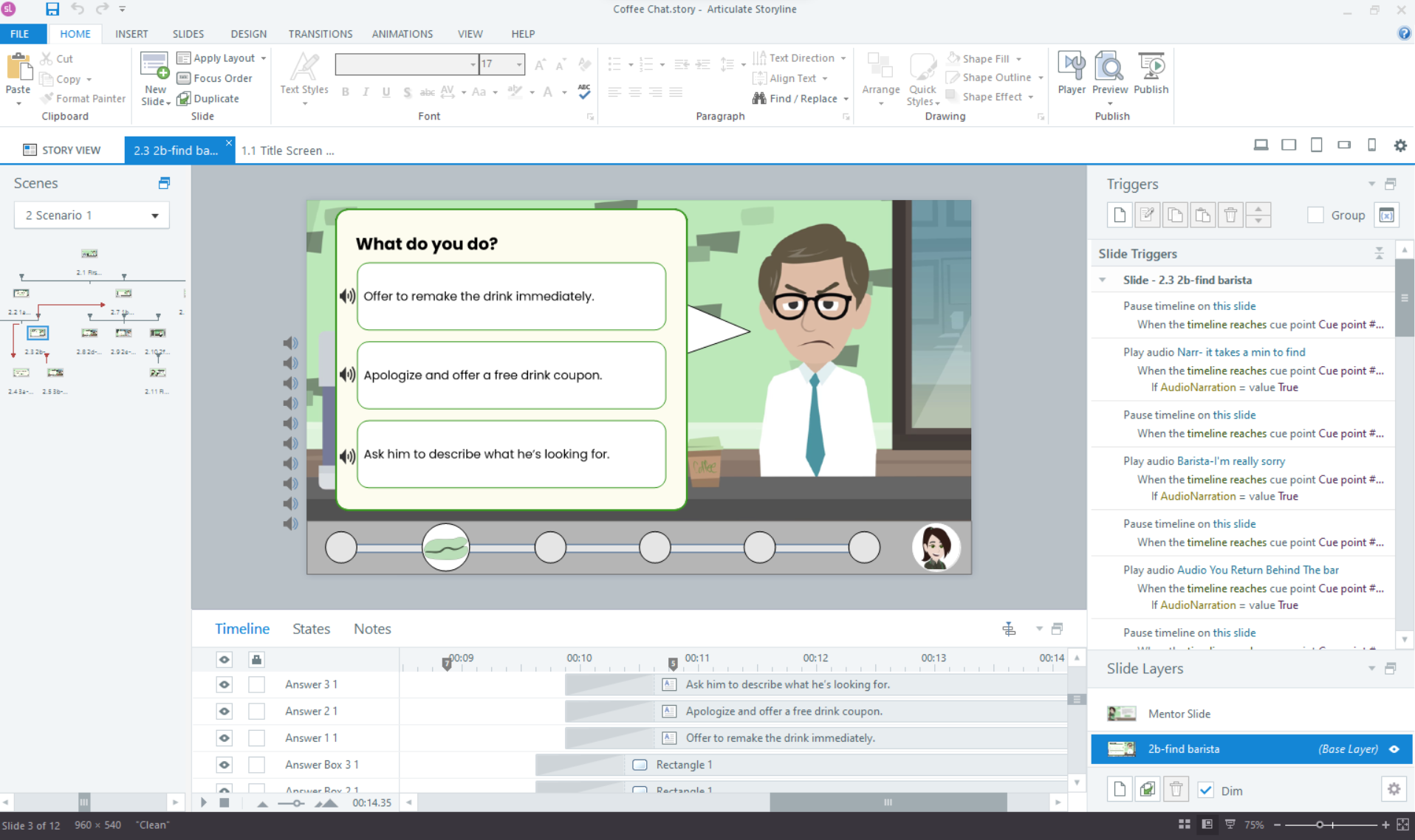
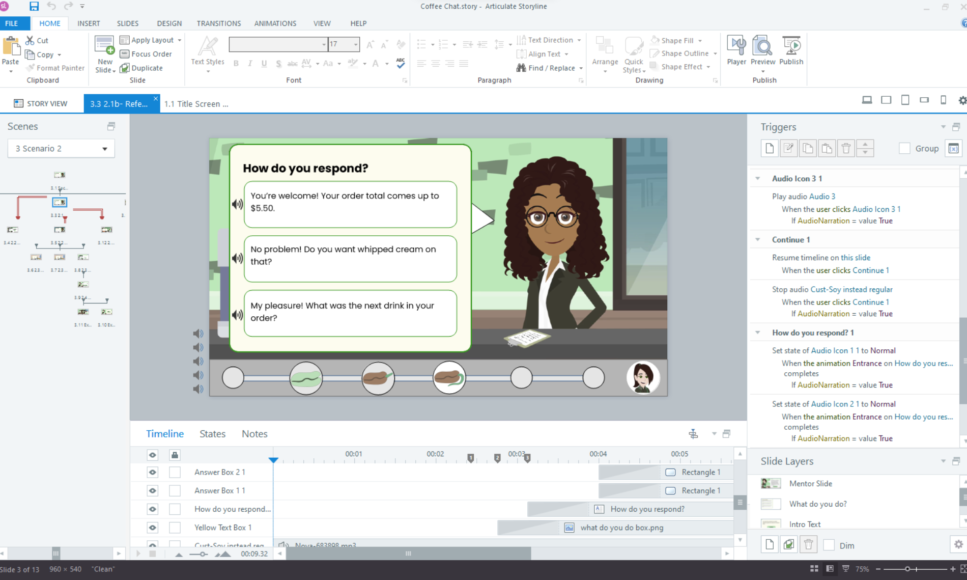
I set the SCORM tracking to use 'complete course' trigger to mark as complete on an LMS.
Results & Reflection
The final product was embraced by my focus group, SMEs, and the learning and development community.
Here are some testimonials:
Here are some testimonials:
Interested in working together?
